8 UX Design Challenges with Connected Devices, Part 2
Part 2, Where Our Story Went Wrong
In the previous installment, 8 UX Challenges with Connected Devices, PART 1, we setup our ‘Story About A Problem’ anecdote to give context to the 8 challenges.
Repetition is good: There is no substitute for real-world user testing. You would think that after decades of designing software experiences, we could just design an app interface where nothing goes wrong or is confusing, everything is a joy to experience, and we are loved and respected for the effort.
To recap our story: our client asked us to design a user experience for a series of smart energy connected devices. The short version is this: your home or apartment has meters to measure use of electricity, water, and (maybe) natural gas. These meters are equipped with low-complexity transceivers using a protocol called ERT (Encoder Receiver Transmitter). ERT is a packet radio protocol developed by Itron for automatic meter reading. The technology is used to transmit data from utility meters over a short range so a utility vehicle can collect meter data without a worker physically inspecting each meter. – Wikipedia)
THE PROBLEM TO SOLVE
Recall the problem to solve: How to bridge ERT to the Internet. All we need is a box to collect the ERT packets from the meters in/around your home, transcode into IP packets, send to the home’s internet router, and Al Gore does the rest (https://www.snopes.com/fact-check/internet-of-lies/).
HAPPY PATH FIELD OBSERVATIONS
We started with an employee of our client as Test Subject Zero, so we could ‘test the test’, so to speak. That went pretty well, not surprisingly, as this person was very technical and had some familiarity with our project’s goals. Being bitten by the internal subject’s dog during the trial was the only hint of what was coming next.
Onwards and upwards: We recruited some homeowners and simulated a ‘drop-ship’ of the packaging on the doorstep of each subject’s home. We rang the doorbell and then followed the user back inside with our clipboards, cameras, and tripods.
The first study subject was a high school teacher, who went through the test like a hot knife through butter, completing the (many) steps defined by the Quick-Start Guide’s checklist:
• Record MAC address of gateway
• Connect gateway to router
• Connect power supply to gateway
• Verify the LEDs
• Record installation code for Zigbee-to-Wi-Fi bridge
• Locate ERT meter (gas)
• Record ERT type and ID values
• Connect power supply to bridge
• Verify LEDs
Seventeen (17) minutes into the experience, the user moved to their living room PC and finished the setup on-line, which took an additional 2 minutes and 25 seconds.
As we described in Part 1, the system was designed in a patented way to auto-discover devices, to the extent technically possible. The screen captures above are steps 5 and 6 of the process, where steps 1-4 are basically entering your name and then confirming auto-discovered elements of the complete system. Zip-Zop, and done; worked like a charm.
We proceeded to run the same test on other usability test subjects. And then… the wheels came off.
8 UX Design Challenges with Connected Devices
1. MATURITY OF THE SERVICE
Often the Service is being developed in parallel with the development of the App. Problems with the back-end Service will manifest themselves in unexpected ways when exposed to real-world users, potentially leaving your customers (or UX researchers) without the tools necessary to troubleshoot the underlying problem.
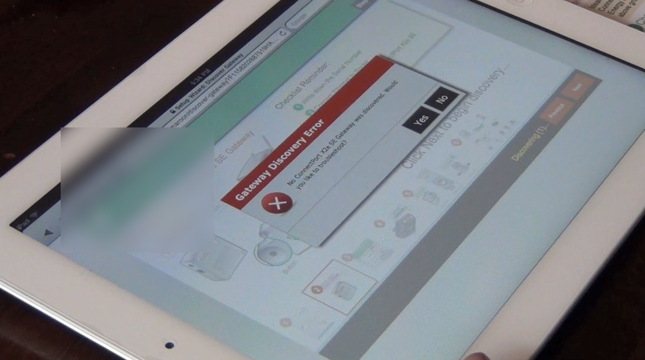
Three out of five subjects used a Mac or an iPad as their primary Internet access device, making native/local network troubleshooting a challenge - even if we had deployed the proposed locally installed Windows-based discovery app. These same test subjects failed to install the prototype, due to failure of the gateway to connect to the Internet – with little help from the web app. Obviously, this could be addressed in a variety of ways, such as a mobile setup experience that could connect to the little box using Bluetooth and proxy setup to troubleshoot information to the cloud service to aid in the diagnosis. Of course, this particular box had no Bluetooth, so Wi-Fi was all that was available.
2. COMPLEXITY OF THE SERVICE
Scaling to a large number of users, with a wide range of user scenarios, using a multitude of connecting apps with different levels of interoperability in operation (i.e. versions), translates into chaos in the field.
The prototype checklist itself shows the complexity of joining the devices encompassing the complete product (which includes devices already installed in your home, such as your utility meters).
3. COMPLEXITY OF THE DEVICES
A corollary to the above: scaling to a large number of devices, a wide range of device availability, a multitude of connecting devices with different versions of firmware in operation, again leads to chaos in the field.
Beware of 'False Affordance'. An apparent affordance that does not have any real function, meaning that the user perceives nonexistent possibilities for action. Fancy wording which describes, in this example, user confusion over the presence of 2 power supply units (PSU). This was a surprise for those observing the test results. The PSUs appear to be the same, but the widgets themselves are very different in appearance, hinting that the PSUs may be specific to one unit or the other, as evidenced by the real-world observed behavior with setup.
4. ASYNCHRONOUS NATURE OF THE REAL WORLD
Many of today’s software developers are acclimated to enterprise systems with large, well-maintained network services. These are (almost) never down or unavailable with low-latency from a networking and a processing perspective.
In our prototype user study, we discovered a wide range of network availability, bandwidth, latency, and throughput speeds. This is changing all the time, of course, but complexity of IoT services are growing at much the same pace. Make sure you are testing your software stack with simulated delays in networking latency, periodic unavailability, and with wide variations in speed.
5. DIFFERING TECHNICAL STANDARDS
Interoperability between communication protocols and transports can create unexpected problems.
Don't assume users know how basic things work! Because we are bridging one radio protocol to another, we were forced to connect a second box to the home owner's internet router. In some of our test cases, the subject didn't know the different between the cable modem and the wireless router. In other cases, the internet router had no open Ethernet ports, which effectively stopped the test for those subjects. If the gateway device (i.e. Zigbee to Internet bridge) was wireless, we could have solved all of these problems by having the gateway join the customer's existing Wi-Fi network - but that's not how the device was designed.
Again, don't assume users know how common things work. Test subjects were tainted with ERT meter knowledge by the test recruitment process - there was obviously a priori knowledge of what an ERT meter was and/or where the utility meters were located within their homes. Even so, there was confusion when attempting to identify Type and ID values for non-compatible meters.
6. THE SMALL SCALE OF THE DEVICE INTERFACE
Many connected devices have small - or no - user interaction mechanism, relying on a smartphone App to provide everything - this can be a challenge when either the App/Phone or the Device are not functioning as expected.
LED Interpretation Issues: Don't overload users with cryptic feedback. Although we expected technologically naive users, we were still surprised by the difficulties many people had in interpreting the meaning of the device LEDs. Subjects demonstrated difficulties determining success from failure while observing changes in LED patterns and colors after device power-on. Checklist could provide more details, of course; our opinion is it wouldn't have helped much. LEDs need to convey a straight-forward 'OK' or ’Not OK' condition – and that’s all.
7. SERIOUS CONSEQUENCES FOR USER ERROR
Connected devices can be 'bricked', or rendered permanently inoperable, by user or software error - designs must focus on the second tenant of usability: Error Tolerant.
8. SERVICE DELAYS
Some service tasks can take a very long time. For example, replicating from one enterprise storage array to another, which may take weeks. The UX needs to accommodate appropriate feedback to ensure that the user is always in control.
End Note
Follow us on LinkedIn to see the next article in your feed.
Ken Krutsch is Founder & President of KRUTSCH, a digital product design firm. From concept to delivery, KRUTSCH specializes in designing consumer and commercial applications. We generate and execute ideas, finding opportunities for our clients to innovate. Because solving the right problem builds careers, organizations and professional relationships.
Follow KRUTSCH on LinkedIn to read the follow-up posts in the series.


