Design Patterns
Proven design patterns for success
KRUTSCH UI Patterns slash the time required to differentiate your digital brand.
Our Patterns
Patterns aren’t a new concept in UI/UX design, but their presence in the apps we design says something of their usefulness. We know how to make them work for you. Check out the frameworks below.
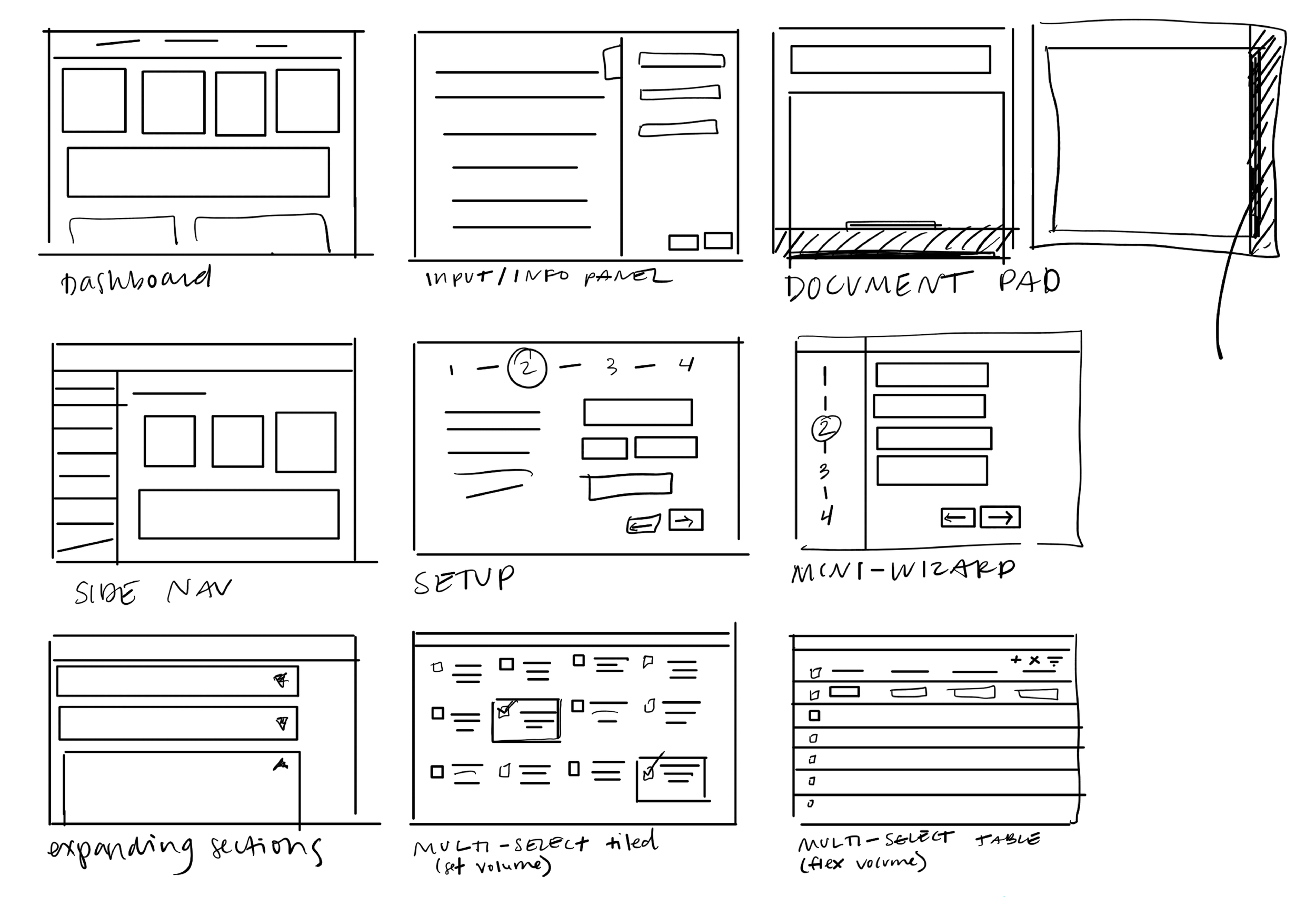
Linear Information Patterns

Task List
Ordered, multi-step tasks break down complex sequences into user friendly sections.
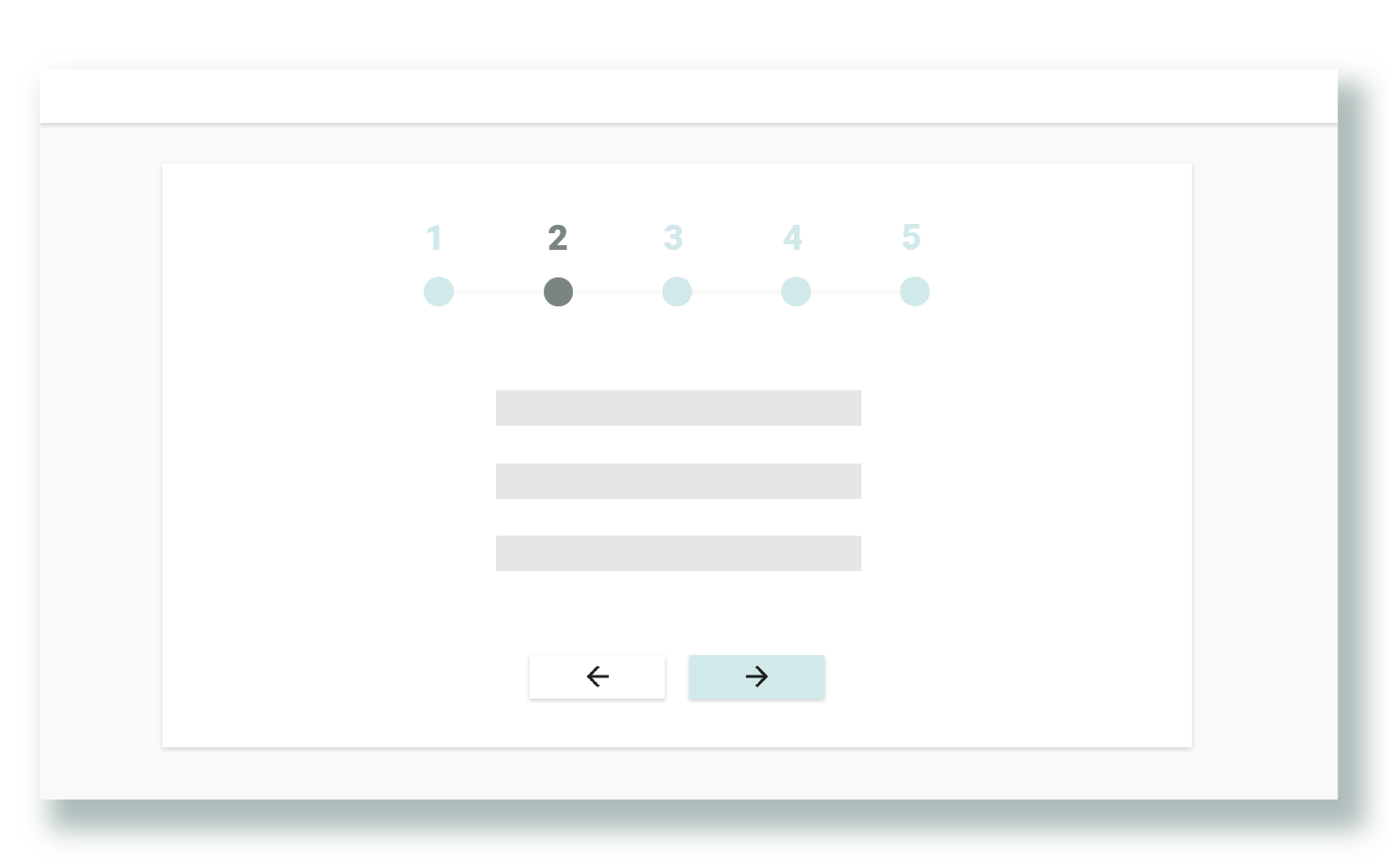
Horizontal Stepper
Ordered, guided instruction with easily digestible steps.

Vertical Stepper
Step-by-step form or data entry provides context: a multi-part form within a single app page using keyboard navigation.
Non Linear Information Patterns

A paper metaphor for a digital system, whether a portrait mode tablet or a multi-screen desktop, this pattern uses a slide-up document pad to preview, review, or edit.
Curious? Interact with this Pattern here.
Document Pad

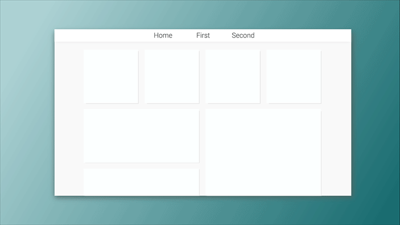
Dashboard
Tiled landing page with a high level view of most important information.

Top Navigation
Organize and navigate between complex workflows.
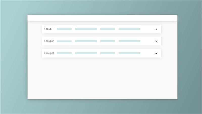
Expanding Sections
Accordion containers that expand and collapse allow the user to focus on relevant content.

Landing Page
Dashboard variant with secondary links customized to support a particular user, role, or instance.
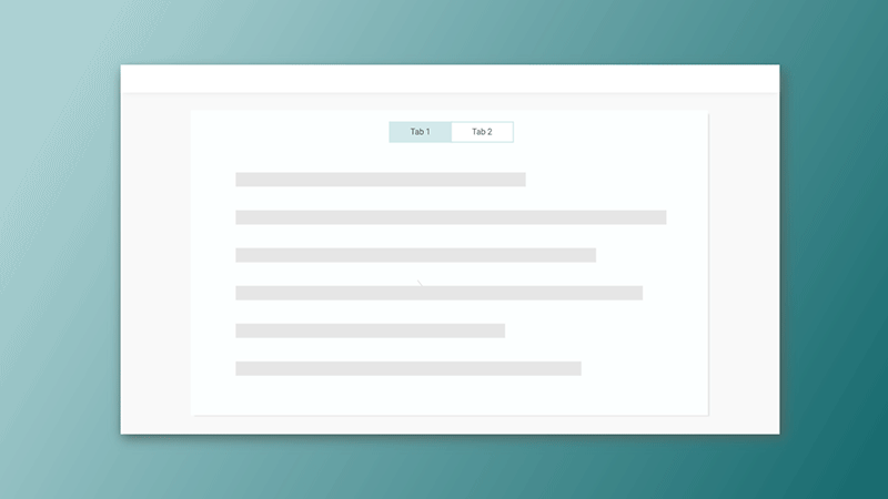
Tabbed Perspective
Tabs show multiple perspectives of the same data.
Expanding Panel
Slide out panel to accommodate space for editing or displaying compound data.

Vertical menu to easily navigate across functionally related pages.
Side Navigation
Data Patterns
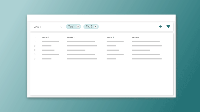
Views By Tag
Tags filter data and are bookmarked into views for easy access and organization.

Tiled Multi-Select
Spacial multi-selection grid of data all on one page for quick scan.
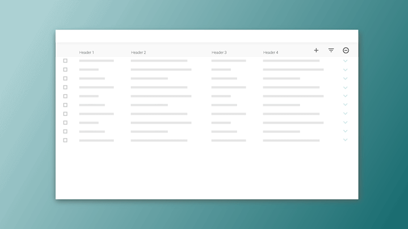
Embedded Table
Table rows provide high level report and expand into subtables for further detail and investigation.

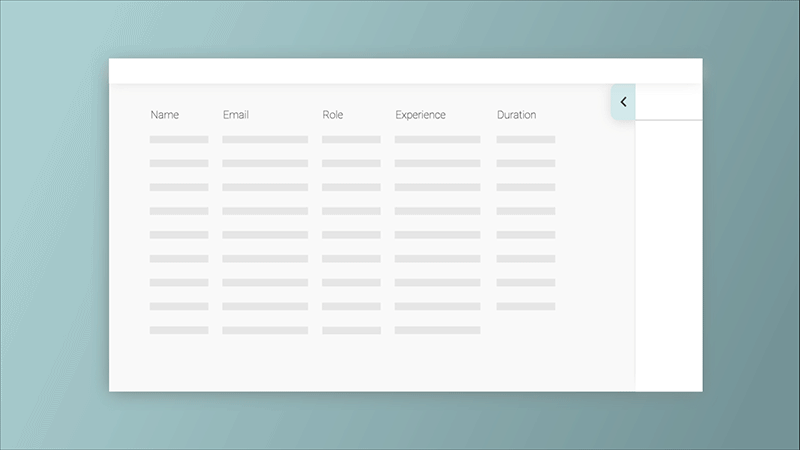
Table View
Manages large, flexible amounts of data for basic creation, editing, and filtering.
Feedback Patterns
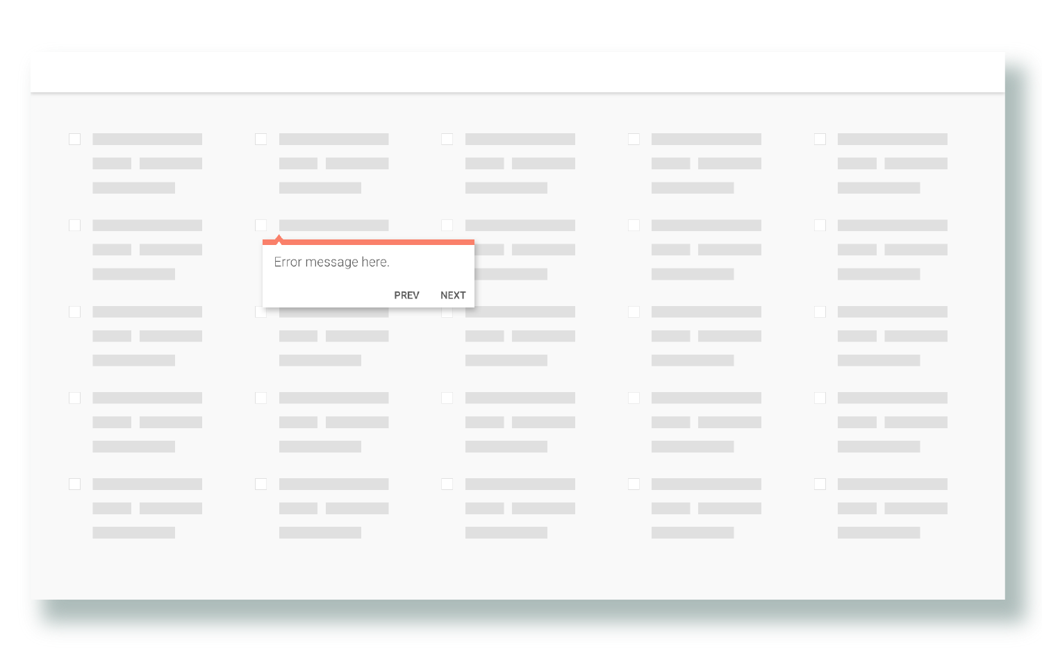
Error Tracking
Callout highlights error and navigates user through a review within or across pages.
Sunburst
Sunburst graphic draws the eye and directs focus to next steps.

Shortcut Menu
An overview of contents and one-click shortcut to embedded pages.
Our Patterns in Action
Watch and listen to our developers walk through some of our most used and most complex KRUTSCH Patterns.
Document Pad
Multi Select
Expanding Panel
-
![screenshot of the mayo clinic patient registration app on desktop]()
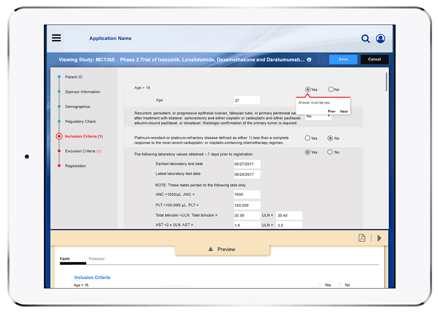
Document Pad
The Document Pad was used in web-based app to help create, manage, and track all aspects of clinical research studies for the #1 healthcare system in the nation (a Davinci Software client).
-
![Dashboard interface with sections for activity, calendar, services, hardware, migration milestones, next milestone, and data migrated. The dashboard displays migration statuses, timelines, and storage usage, with a pop-up showing details of a specific migration job.]()
Dashboard
An appliance-embedded, web-based app to setup, manage, and monitor all aspects of storage migration.
-
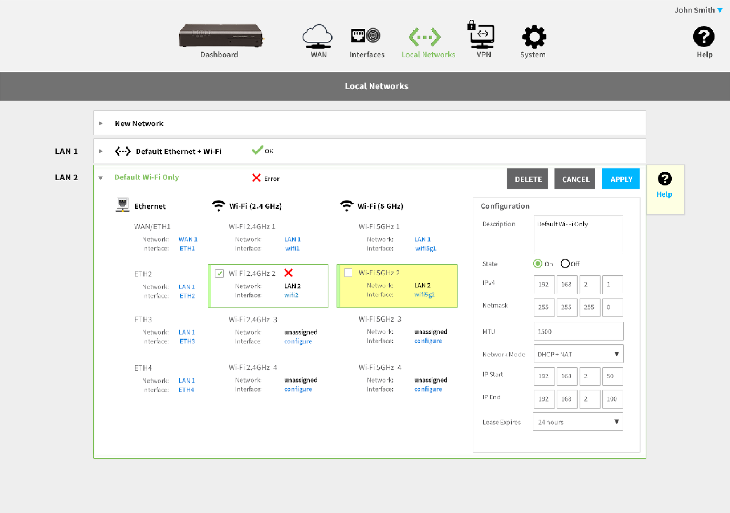
![Router's web interface showing network configuration with LAN and Wi-Fi settings, including active, error, and unassigned networks.]()
Error Tracking
Used for an app that interacts with an enterprise-grade wireless router that includes support for a variety of connections, including multiple cellular networks.
-
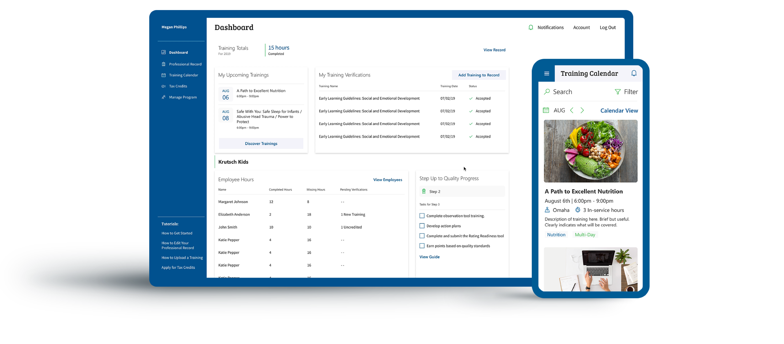
![Dashboard and mobile app interface displaying training schedule, verifications, employee hours, and progress for a nutrition training program with a colorful food image.]()
Dashboard
A dashboard that verifies professionals’ credentials, pushes training opportunities, and centralizes personal records.
-
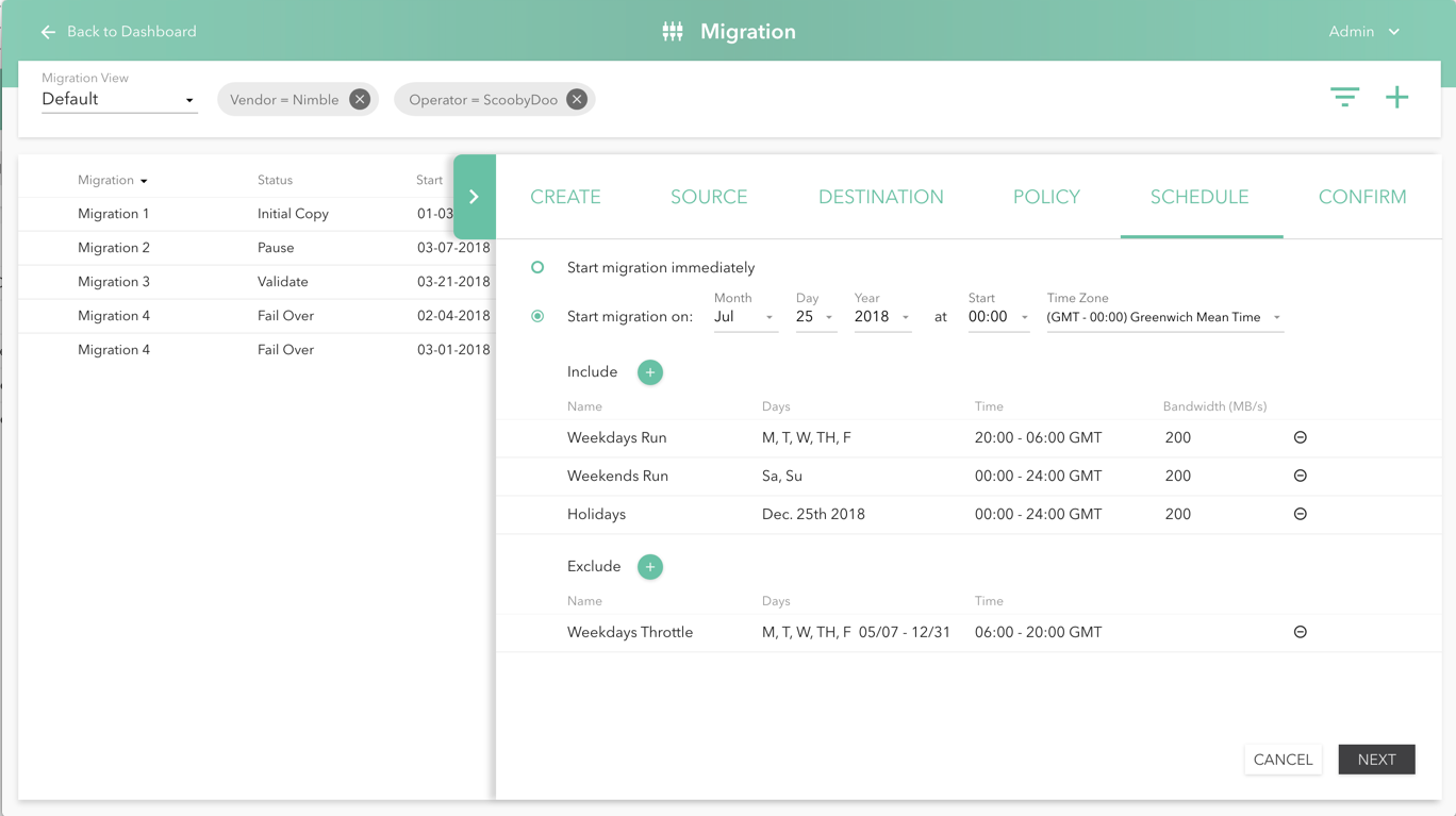
![Screenshot of a software interface for managing data migrations, with tabs labeled CREATE, SOURCE, DESTINATION, POLICY, SCHEDULE, CONFIRM, and options to start, pause, validate, or fail over migrations. The interface includes sections for scheduling migration activities with details on days, times, and bandwidth.]()
Expanding Panel
An appliance-embedded, web-based app to setup, manage, and monitor all aspects of storage migration.