
UX Design Life-Cycle, Part 5: Establish a Visual Language
Background
We are a small team of talented creatives and developers, answering the question: “...tell us about your process or design principles.”
We are going to do something far more valuable: write about what has worked and what has not worked.
In the weeks ahead, KRUTSCH will post a series of bite-sized articles that encapsulate a decade of experience leading the life-cycle of product design and user experience (UX), across a variety of industries, with clients both large and small, including consumer and commercial projects.
This is Part 5: Establish a Visual Language. You can read the introductory post here: UX Design Life-cycle, A Mini-Series.
Follow us on LinkedIn to see the next chapter in your feed.
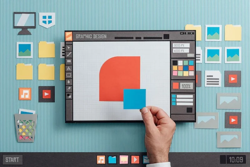
What is Visual Design?
The Interaction Design Foundation defines visual design as a practice "to shape and improve the user experience through considering the effects of illustrations, photography, typography, space, layouts, and color on the usability of products and on their aesthetic appeal.”
Though an important component, visual design affects more than the aesthetics of a project. It influences usability, comprehension, and emotional responses. It’s a powerful tool for communicating with users.
Visual Design as a Tool
"What’s the most beautiful thing you’ve designed?” This was a final question posed to us by a potential client. After an hour of walking through our technical and managerial capabilities, our process and team roles, it was a natural next question. Okay, great, now show me some eye candy.
While simple on the surface, this question fails to address the real power behind visual design: it’s ability to become a visual language. It skips right to, “what kind of coat of paint can you put on this app for me?”. Don’t get me wrong, beauty is essential to design. It’s the strongest tool for building emotional, intangible connections with users: all Apple products. But in UX design, it’s important that your designs use beauty as a tool to further a goal, to push the workflow along and accomplish the main success scenario.
BUILD TRUST & INTEREST THROUGH VISUAL LANGUAGE
We lean heavily on the communication qualities of visual design to build a visual language for your app or service. More than a coat of paint, establishing a visual language builds visual cues for the user across the entire application or system. While cultivating an illuminated pathway through the app, your visual language engages users and builds trust and interest, as defined by usability.gov.
A visual language that builds trust meets user expectations. On a macro level, it reinforces brand and matches use case. For example, a shopping app will have a very different visual language than a medical data entry app. The first would have more freedom to show off images, take up space, be playful in displaying its product. A data entry app would prioritize tables, fields and charts for inputting and displaying data, be efficient with space, and more structured and serious in tone. If one looked like the other, the user’s trust level would drop because of a disconnect between the visual cues and functional expectations.
On a micro level, a visual language builds trust by being clear and consistent. This could include the styling and use of feedback patterns for success or error cues. Consistent action button styling, modal language and layouts, components, etc. Clarity and consistency throughout the app guide the user more easily through the workflow, and therefore increases usability.
A visual language that builds interest pays attention to details. It finds moments to delight users and build emotional connections while supporting the main success scenario.
Together, these steps for building trust and interest contribute to the overall beauty AND usability of an app or service. With this in mind, we’ve developed a design process that thrives on consistency, attends to the details, and prioritizes trust.
How to Establish Visual Language
We learned to establish a visual language early on in the creative process. Doing so builds clarity and consistency throughout the design process. It also helps the client visualize their product vision early.
We utilize a few deliverable benchmarks for establishing a visual language:
Stylized Component Stickersheet
First Looks
High-Fidelity Storyboards
STYLIZED COMPONENT STICKERSHEETS

As discussed, consistency is critical for your visual language to be effective. We use a Stylized Component Sticker sheet to quickly asses how branded colors, fonts, and standards will be used within our design components. We quickly apply an action color to buttons, a style to modals, a pattern for cards. Then, when building high fidelity screens, components are always drawn from the stickersheet to ensure consistency across all workflows.
FIRST LOOKS
After defining the problem and gathering user research, we’re busy developing the happy path user workflow. Once we have a broad idea of the major patterns for the app, we draw up First Looks for the client. A handful of medium-fidelity key storyboards, we incorporate branded colors, essential visual cues and stylized components.
Clients are busy and you are competing for their attention. Don’t make them work too hard when trying to visualize your design of their product vision. Providing First Looks helps the client conceptualize your design early on and makes the project feel more tangible. By inserting a stronger picture in their mind, you build trust and increase engagement with the client.
HIGH-FIDELITY STORYBOARDS

Sketches that leverage successful patterns are then illustrated as hi-fidelity storyboards, establishing the visual language for your web-based app. These are the evolving, but pixel perfect, screens that will be built into a prototype and/or handed off to developers.
More than eye candy, the final storyboards should seamlessly employ your visual language to increase comprehension, develop trust, build interest, and drive usability of your app or service. What’s more beautiful than that?
End Note
Share your experiences in the comments section – we are all here to learn.
Follow us on LinkedIn to see the next chapter in your feed.

Emma Aversa is a visual designer at KRUTSCH, with a background in architectural design. She excels at digital design and communication executed through simple, function-forward solutions.