

Research Protocol Catalog
Helping specialists at Mayo Clinic connect patients with cutting-edge care.

Mayo Clinic is proudly ranked as the number one hospital in the United States. This nonprofit American academic medical center is dedicated to integrated healthcare, education, and pioneering research, attracting patients worldwide.
The Opportunity
Mayo Clinic’s old Research Protocol Catalog (RPC) app was not working. No clinicians (as in zero) used it to keep track of clinical trials or connect patients with opportunities. With so many ongoing trials at any given time, they knew doctors were missing out on opportunities to connect their patients with potentially life changing care.
The Goal
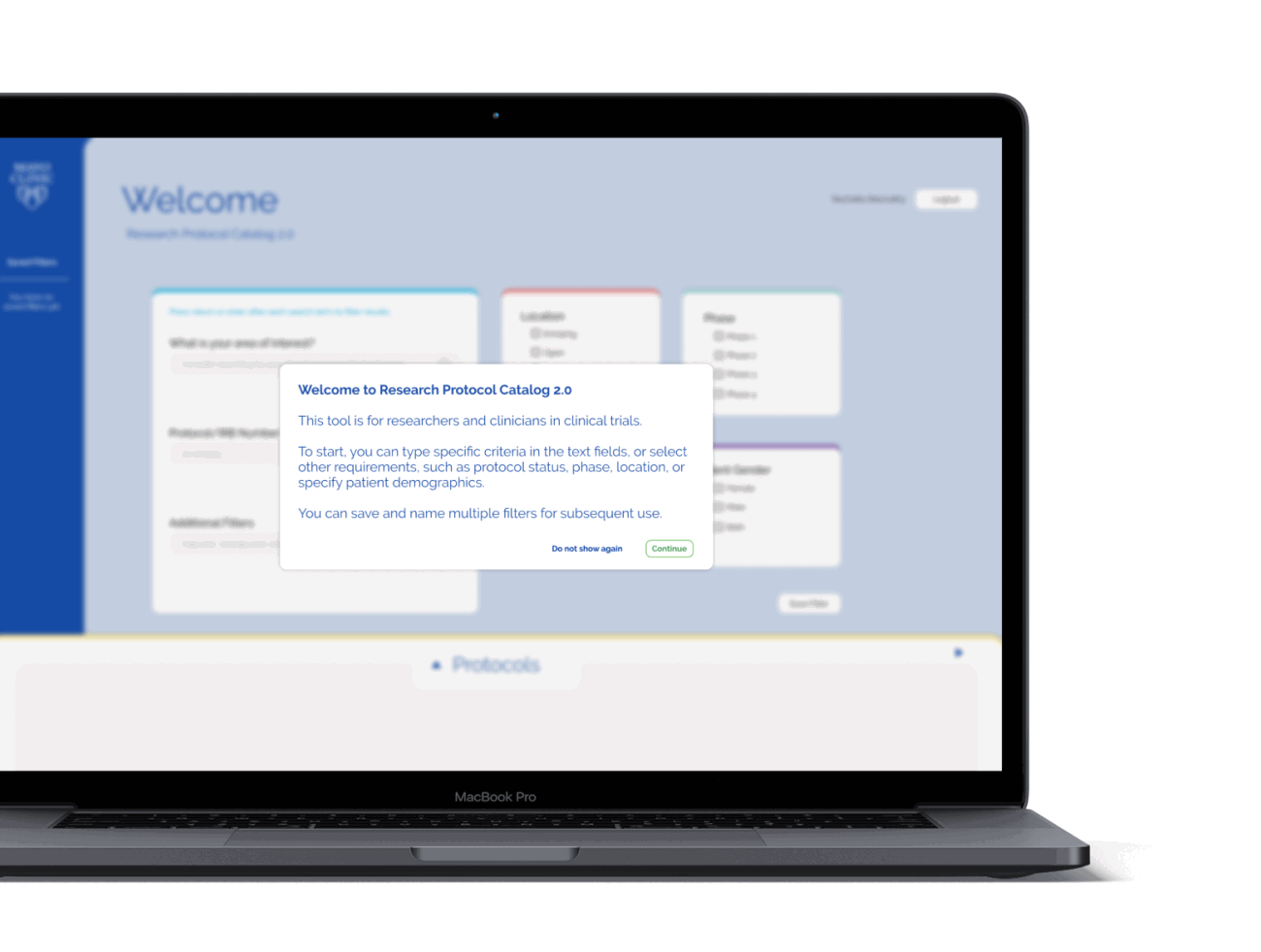
The RPC app was meant to be an exceptionally easy-to-use database. Doctors and specialists needed a way to find appropriate live clinical trials that their patients qualify for. So we prioritized making sure that search and navigation functionality worked well through multiple filters and criteria.
The Design Focus
For databases, we believe that hierarchy creates efficiency. And we needed to be very efficient for clinicians with limited time to spend with their patients. Our reframed approach organized results in an intuitive way, helping doctors and specialists find specific trials for patients’ cancer type and then easily viewable trial details and enrollment information.
Getting to Work
KRUTSCH started with a series of workshop sessions featuring nearly a dozen oncologists and cancer researchers. Chatting with these clinicians gave us a full understanding of the pain points of the existing app and helped us realize what the end goal should look like if we wanted it to be widely adopted.
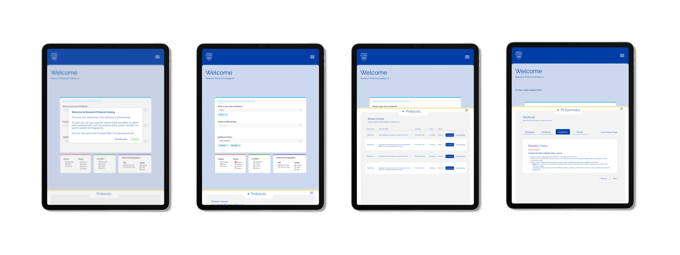
We prioritized simplifying content, establishing an intuitive hierarchy, and creating repeatable patterns for clinicians to create and save filters for various searches.
With a clear workflow outlined, we built out low fidelity wireframes to test real examples of where content could live on the screen. Our iterative process helped establish a visual language as we moved closer to high fidelity screens in Figma.


We developed more specific uses of color that helped users flow through the UI. In the end, we were able to craft a platform that helps oncologists efficiently add and save high level patient data, search for and find clinical trials, and ensure their most valuable time is spent on their patients, not clicking through an app.
