Minneapolis Heart Institute Foundation®
PCI App
Transforming aortic procedures for cardiothoracic surgeons.
For over 40 years, MHIF has been one of the leading nonprofit research and education institutions in the country. With over 230 active research studies and publications ongoing each year, the organization improves the cardiovascular health of individuals and communities through innovative research and education.
The Opportunity
The PCI app is an educational tool to help cardiologists overcome challenges and improve the outcomes of percutaneous coronary intervention by presenting the algorithms used through an easy to access, free app.
MHIF approached KRUTSCH to help design and develop iOS and Android apps to be used by interventional cardiologists, cardiology fellows, researchers, cardiac catheterization laboratory personnel, and related industry professionals globally.
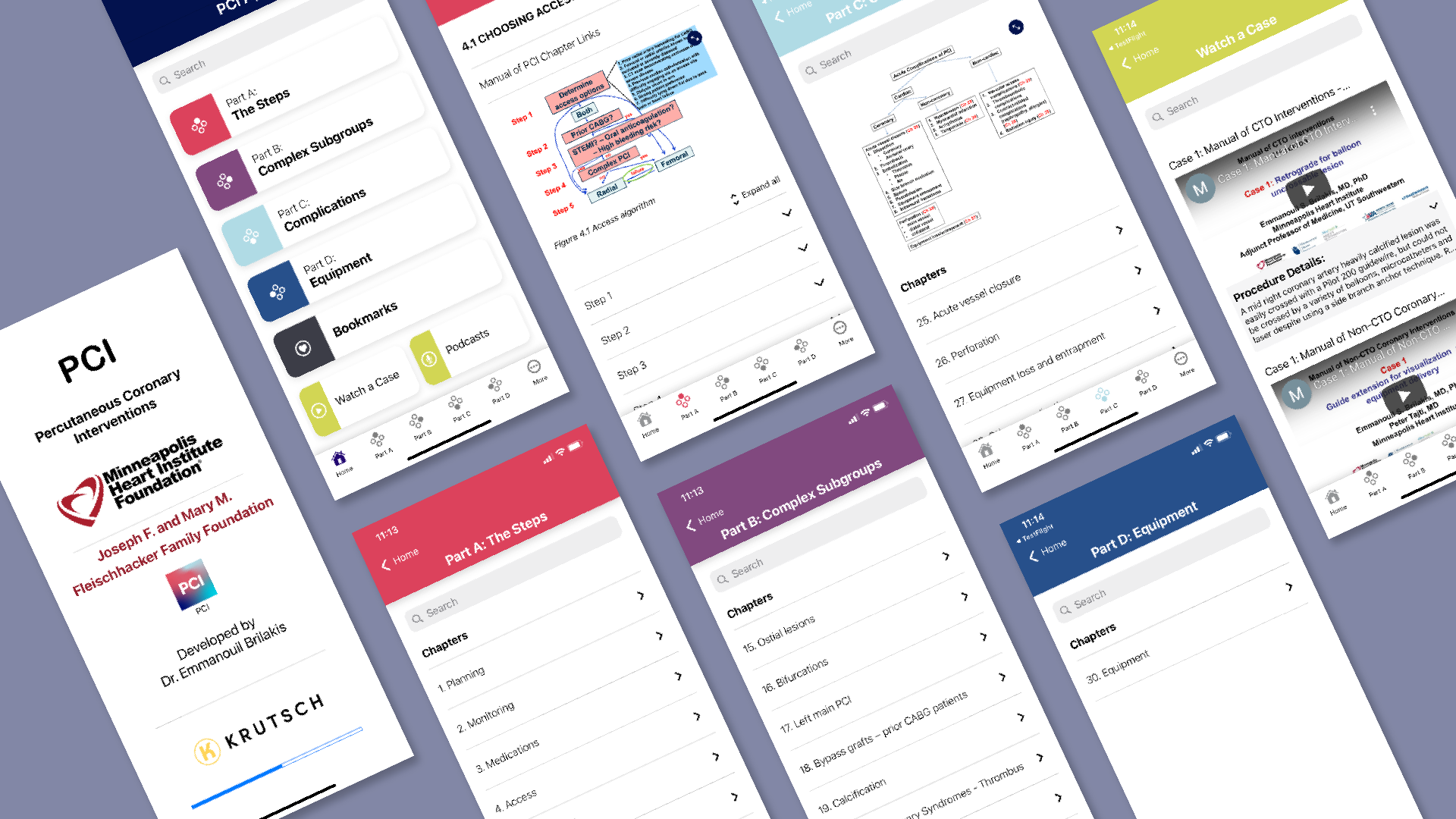
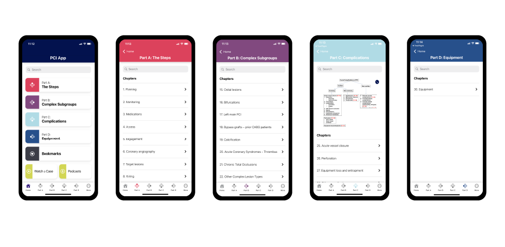
The PCI app is an algorithmic step-by-step approach to percutaneous coronary intervention divided into 4 parts: The Steps, Complex Subgroups, Complications, and Equipment.

The Goal
MHIF’s needs encouraged KRUTSCH to approach the project from both a design and backend perspective.
The Design Focus
Using the existing written manual as reference, we dove into designing the workflow that would prioritize content hierarchy, serachability, and clickability of chapter, section, and subsection content that users can quickly navigate through for reference both before and during surgery.
The Development Focus
Organize data into a relational database and enable MHIF personnel to make changes to content as they see fit to reflect updated medical findings. Adopting a low code approach to data entry through the use of Airtable and Google Firestore gives MHIF the power to update data without having to push new apps to the Apple App Store and Google Play Store.
Designing the App
Workshop Sessions / Feature Set / Workflow
KRUTSCH conducted several workshop sessions early in the design phase to get a full understanding of the problem at hand and goals for PCI. Through these workshops we uncovered the main success scenario was to migrate the content from the physical manual into a mobile platform that was organized, searchable, and clickable. Once the initial feature set was established, we mapped out a workflow to show how users would navigate through chapters and sections of the PCI App.
The original text for the PCI Manual is incredibly dense. We discovered that the Manual of Percutaneous Coronary Interventions houses several hundred images and videos. Making it a priority to utilize an intuitive browser/viewer that doesn’t require the user to constantly rotate their phone from portrait to landscape was going to be an invaluable feature.
The amount of media and text content within the app drove an iterative design phase that allowed us to rework the user experience. It was important that users didn't feel inundated with the amount of information that would be housed within the app.
With this in mind we build out wireframes in Miro, which led to high fidelity storyboards designed in Adobe XD that prioritized intuitive navigation and design.
Lastly, while PCI has a different audience from the three apps that make up the MHIF suite, we still wanted a visual language that felt cohesive and followed the clients guidelines. A happy-path prototype created in XD showed how users would view chapter and section content within the PCI App. This guidance was then handed off to KRUTSCH’s internal development team.
BUILDING THE DATA MODEL
Airtable Entry / Staging Database / Google Firebase
We utilized Airtable as our database to enter and organize data that would be pushed to the app. In Airtable we enabled rich text in the long text fields to format how content would display in the app by using the pop up menus that appear when you click into the text fields. This gave us the ability to perform inline text and paragraph formatting where needed, such as assigning specific headers, making text bold or italic, inserting links, and adding lists.
Once content edits have been completed we run Airtable Automations which send the updated content to a Firebase Realtime Database. In order for the media and text content to display as it was entered in Airtable, we used a React Native Markdown renderer. This made it possible to enter video and image content as plain text in Airtable and for them to display in the app as actual media files. By using both Markdown and Javascript, we created internal navigation between chapters and sections, so the users can navigate to related chapter and section content without losing their original place.
Airtable allowed for quick data entry, which also gave the client the ability to go in and update content as they see fit. This gives power back to the client so they aren’t beholden to an agency for minor content tweaks. Airtable also gives our client the ability to only push new data out to the apps, lessening the weight of the app for their users each time they launch the app. With offline operability, cardiologists around the world have access to this database of percutaneous coronary interventions even in the most remote parts of the world.
The Result
What resulted was a mobile version of the PCI Manual that’s accessible for users anywhere regardless of internet connection. When users have a stable internet connection, the app syncs the latest information so users can have access to the latest content. Algorithms are easily searchable, and a clear visual hierarchy was established to make step-by-step instructions easy to digest for users.


