KRUTSCH’s New Site: What to Know
We've just launched our brand-new website, designed to better showcase our creative work and capture the essence of who we are. This update is more than just a new look-it's a transformation that aligns with our vision and enhances how we communicate. Keep reading for a detailed look at why we decided to make this change, what went into the process, and what you can expect.
The Journey to the New Site
As the saying goes, "A picture is worth a thousand words." Our old site was doing a good job of outlining our services and achievements, but we realized that typically visuals speak louder than words. Our decision to revamp our digital presence came from the desire to better showcase the innovative work we produce and to communicate more effectively who we are as a team.
The journey towards our new site began about a year ago. In late winter and early spring, we began the planning phase, allocating resources and tasks. While meeting, we decided that this project should become a priority, just like our clients are. If we don’t take care of ourselves, how can we effectively serve our clients?
We collaborated closely with our unofficial copywriter, to create a narrative that would resonate with our audience. Our goal was to create engaging content that aligns with our vision and captures the essence of KRUTSCH.
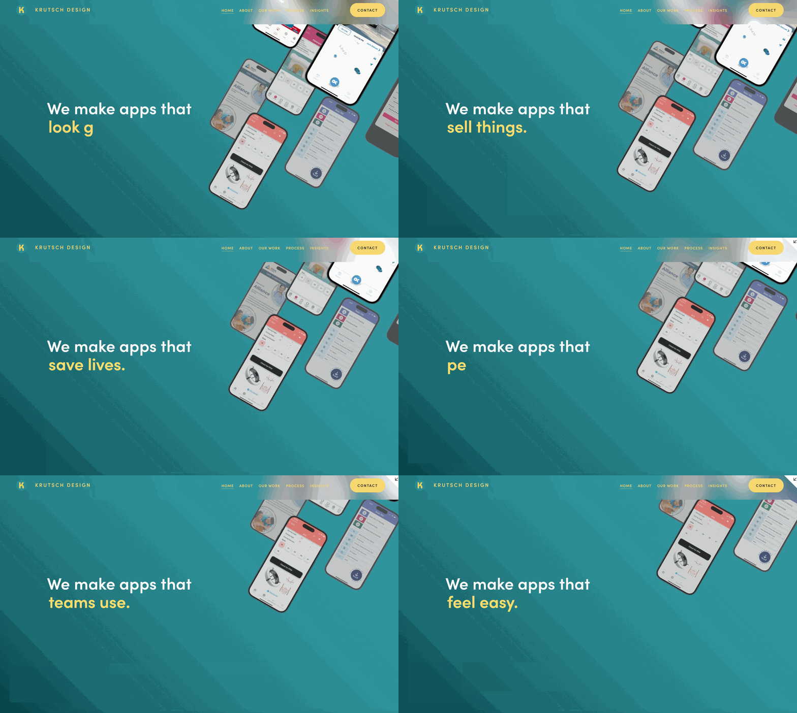
The KRUTSCH home page now showcases what we do clearly with movement and bold, straight-forward copy.
The Vision
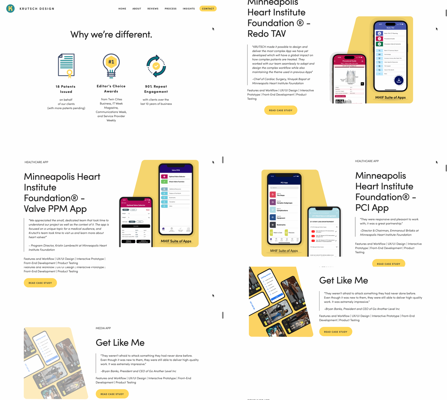
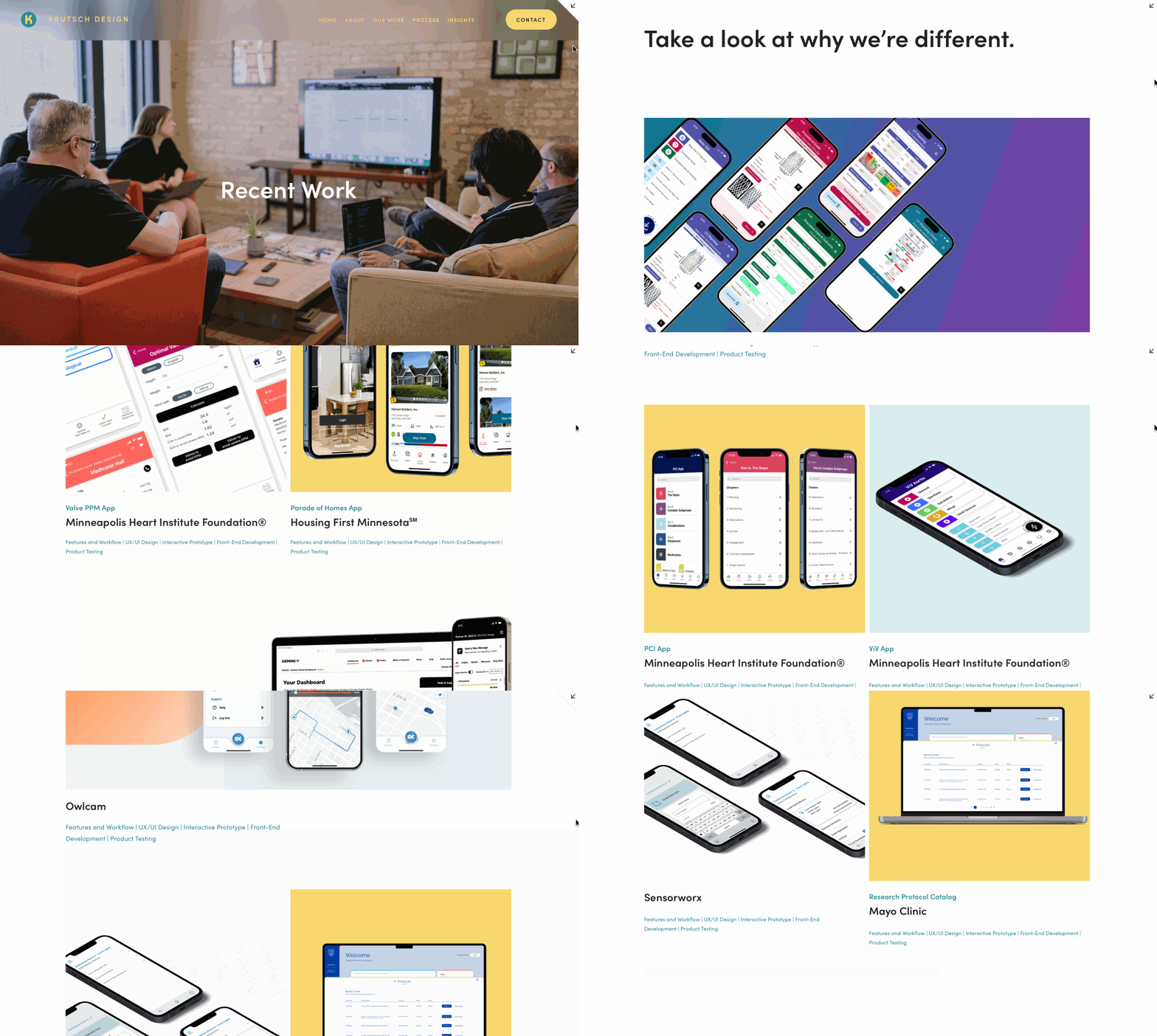
Our Old Site
Our New Site
Our vision for our new site was clear: we wanted it to be more than just a platform for showcasing our work. We wanted to strike a balance between highlighting our designs and creating an immersive experience for visitors. The site's new direction blends the familiar tone of our previous work with a fresh twist, ensuring it remains relevant while reflecting current trends.
What To Expect From KRUTSCH's New Site
While staying true to KRUTSCH's brand, the aesthetic has been updated to prioritize what is important. We've moved from heavy, written content to offer a more streamlined and emotionally engaging experience.
We've made navigation easy. Whether you land on the home page, dive into the About section to learn more about out team, explore our portfolio, etc., we want you to quickly find what you are looking for intuitively.
Looking Ahead to The Future
We're eager to see how the new site will impact how we interact with clients in the future. While we do not expect overnight changes, we anticipate that our online presence will now make it easier for you to connect with us and appreciate the full scope of our creative capabilities.
End Note
We hope you enjoy exploring the new KRUTSCH website as much as we enjoyed creating it.
Rachelle is a UX designer whose work focuses on integrating beauty into the pragmatic function of our everyday life. She is a creative thinker, a perceptive collaborator, and an enthusiastic worker.
Funmi is a marketing analyst that loves to look at life through a creative lens. She enjoys problem solving and thinking outside the box.


