Owlcam Dash Cam
Reimagining an IoT app from the ground up.
Proving our expertise with connected devices to reimagine a dash cam app.
Owlcam is a next-generation dash cam that provides 24/7 vehicle surveillance for security and safety.
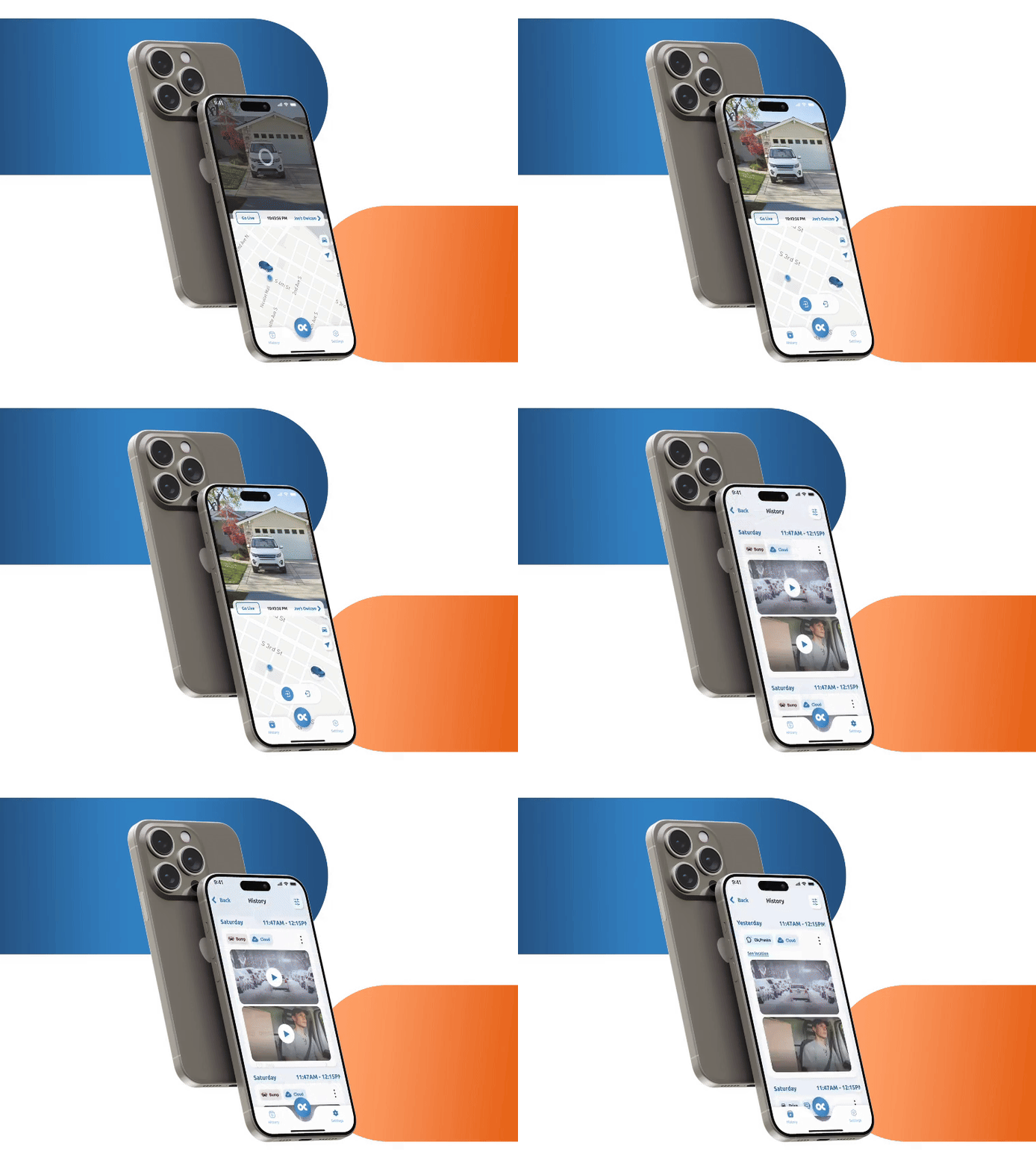
Left: previous version of Owlcam app. Right: updated version of Owlcam app.
The Opportunity
With a 2-star rating in the App Store, Sensata knew they needed a change. So they asked KRUTSCH to step in and reimagine the Owlcam app.
The Goal
The app needed significant help on all fronts.
We set our sights on increasing functionality, enhancing the UI and making it easy for any customer to use. More than that, our clients challenged us to make it feel good to use. They wanted an app that impressed with every tap.
Getting to work
The Design Focus
User testing helped us confirm which parts of the app were leading to the most frustration–and subsequent 2-star rating.
We started our improvements by prioritizing intuitive UI features and design. This app needed standard features that worked for basic users from the start along with advanced features that let more seasoned drivers get what they wanted.
The Development Focus
Our dev team focused on building a UI that worked well with Sensata’s infrastructure. We worked closely with their in-house team while they were making simultaneous upgrades to ensure compatibility. Early on, we identified React Native as our preferred tool because it allowed for more rapid deployment for iOS and Android.
The design process started with workshops between KRUTSCH and product managers at Sensata, which owns the Owlcam brand.
After diving into product background, we identified pain points and a wish list of features together.
Next up came workflow design, which helped our UX and dev teams identify the most complex and crucial app components. This helped all teams agree on the core pieces of functionality that were necessary to have a successful relaunch.
Armed with clickable prototypes, we headed into user testing. Soon we were conducting qualitative user tests to see how well this redesigned app performed with new users.

Then came feature recommendations. At this stage, KRUTSCH brought specific ideas that supported our goal of intuitive usability for every user.
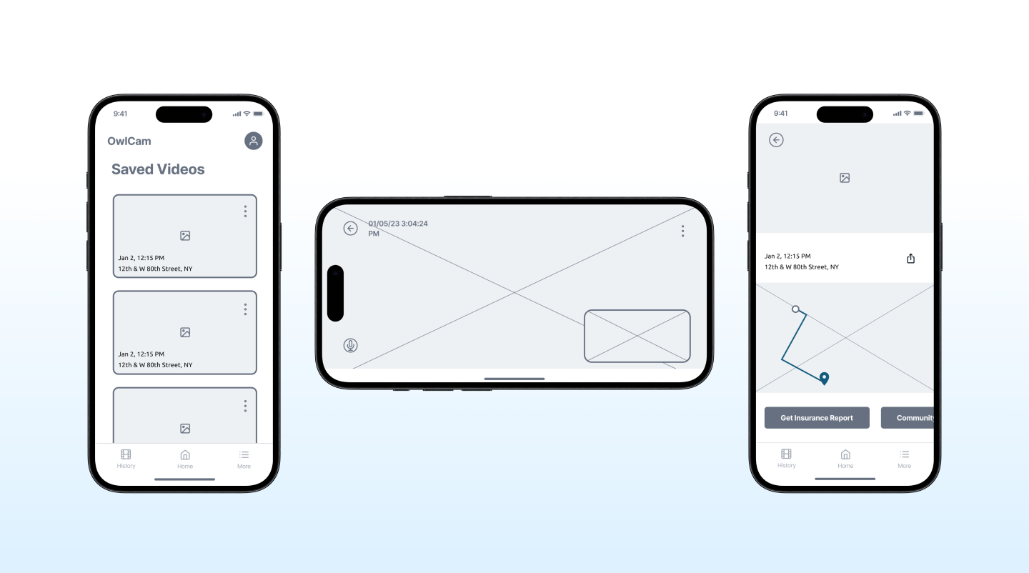
These ideas helped fuel an iterative design process with teams from both Owlcam and KRUTSCH. As we built low fidelity wireframes, we established a clear path for the next phase of the project.
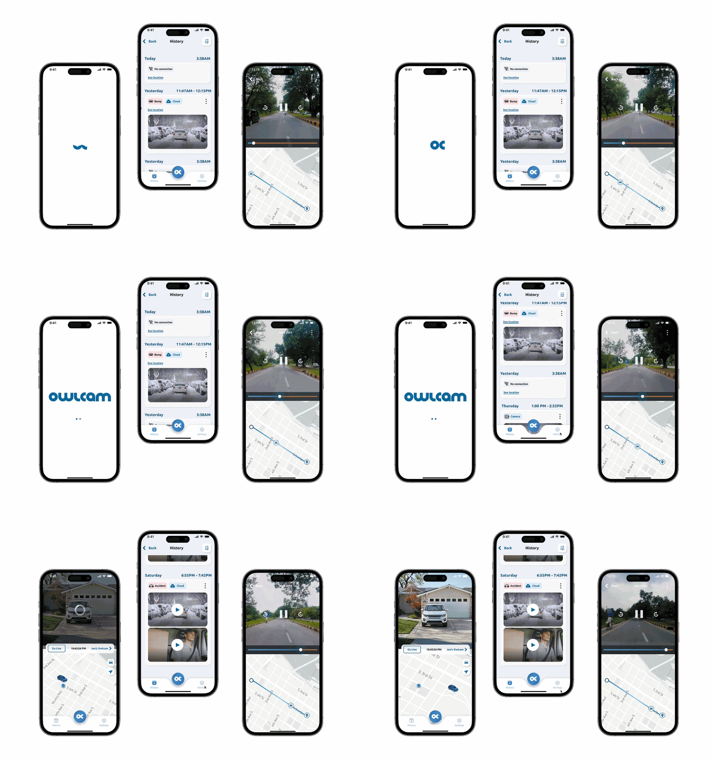
Our teams moved into low fidelity wireframes, and then Figma prototypes and hi-fidelity screens. This is where we really started making the app feel flashy and fun to use to answer our clients’ desire for an app that impresses. We built on Owlcam brand guidelines with animations, new iconography and other great visuals that enhanced the flow right from login.
The verdict came in quick: our work so far was worth it. The app felt easy. It clicked with users from the start. And just a few weeks of code later we were well on our way to delivering an app that would redefine how Owlcam owners use their dash cams.


