
Device Design Guidelines: Designing Successful Apps
The goal of UX in mobile app design is to have a positive user experience and interaction with an app. To do this, device design guidelines are important to shape the basis of UX design.
What Are Device Design Guidelines?
Device design guidelines are a collection of recommended guidelines for designing user interface (UI) for specific devices or a set of devices. While at first it may seem restrictive, these guidelines contribute to the overall cohesiveness of a user's experience with a device.
For example, Human Interface Guidelines by Apple and Material Design Guidelines by Android we often consider while designing for mobile apps for iOS and Android, respectively. When a user is interacting with an app on a specific mobile device, they expect their experience to behave in similar ways to other system apps on their phone. Predetermined fonts, colors, and animations immerse the user in the overall experience of their device.
IMPLEMENTING DEVICE DESIGN GUIDELINES
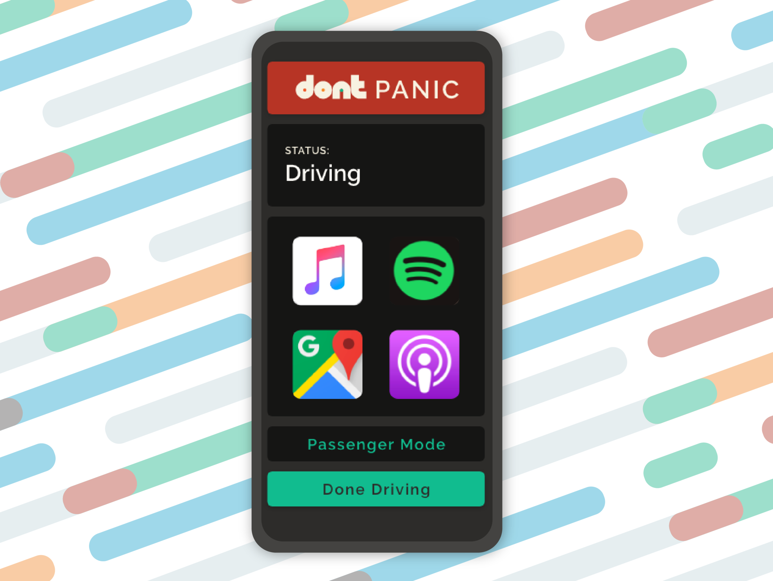
Implementing these guidelines doesn't always come easy. As an example, Human Interface Guidelines for watchOS can paint designers in a tight digital corner. Screen real estate is laughably small, and device font and color limitations make creating an app specific to a brand, difficult. Apple has a reason, though: a user's experience using Apple Watch should not be compromised only because they're not using a preloaded system app. Strava, a social network for athletes, records user's speed and distance during running or biking while wearing their Apple Watch.

Strava’s UI keeps the user within the Apple Watch experience while providing a unique social media experience for athletes.
10 UI Design Guidelines
Although, iOS and Android have their own device design guidelines, there are some general guidelines every designer should be taking advantage of no matter what device the app will be running. Jakob Nelson, a prominent web usability consultant, and Rolf Molich, a renowned usability expert, outlined 10 UI design guidelines that can be easy for any UI/UX designer to follow.
Visibility of System Status
When designing, the users should always know and be informed about what is going on in system operations. This needs to be in an easy to understand format with a reasonable amount of time.
When users know about the system, they can have predictable interactions. This leads to trust in the product and the brand.

iPhone uses visibility of system status when showing notifications in a counting format. Users know the number they see is as many times the app has had a notification for them.
2. Matching the System and Real World
The design should be something all users can understand. Designers should opt for copying similar language and phrases that will be seen in the real world.
The hope is to not use technical terms that may have been used internally. Terms that you may have used with your team while designing may not be as clear and easy to understand to your specific users. Think of the users, so that the terms, icons, images, texts, etc. are things they will be more than familiar with.
When KRUTSCH designed dont™ we knew the panic button that allowed teens to instantly reach out to their parents needed to be the highest priority. This is why we made it red, resembling panic images like fire alarms, exit signs, etc. that are all around us in the real world.
3. User Control and Freedom
No user wants to feel limited when using an app. So offer users options to go backwards, undo actions, etc. This allows for space to make mistakes without having the need to go through an extended process to get back to the original point.
When there is an easy way for users to undo an action or leave a process, it brings a relaxing feeling. Getting stuck on an app can breed frustration. Allowing freedom, lets users get to remain in control.
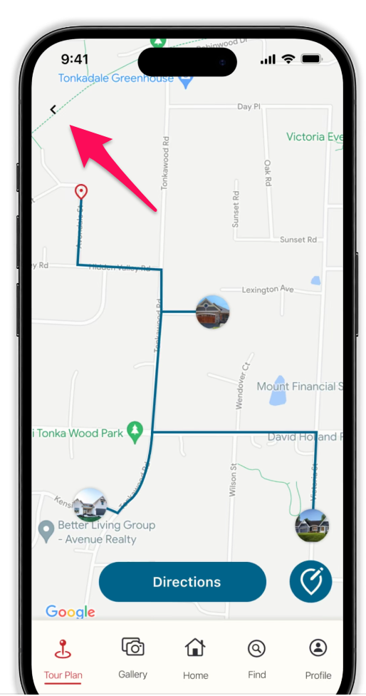
When designing the Parade of Homes app, KRUTSCH knew that there needed to be an accessible back button that could allow users to go back if they made a mistake.
4. Consistency and Standards
UI designers need to ensure that all words, actions, and potential situations have the same meaning across platforms. Consistency across platforms means no confusion for users. Failure to maintain consistency forces users to increase their cognitive load, which can be a headache.

When KRUTSCH worked with Minneapolis Heart Institute Foundation, we brought consistency across their different apps. This allows users to easily navigate no matter the app they are currently using.
5. Error Prevention
Error prevention is a key component in UI design. Having minimal to no errors allows users to comfortably use an app for a longer period of time. Failing to prevent errors can cause potential users to get fed up with your app and stop using it!
When error preventing, there are two errors to look out for: slips and mistakes. Slips are errors caused unconsciously by inattention. Mistakes are conscious errors due to a discrepancy between the design and how the user thinks.
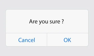
Common error messages like this ensure that a user will not make a mistake and is sure of the action they are committing.
6. Recognition Rather Than Recall
Eliminate stress from users by allowing them to see elements, actions, and options. Humans have short-term memories, which means they do not want to have to keep storage of every way to navigate your app. The memory load can be taken off of users and instead allow them to navigate through the app easier by promoting recognition of information.
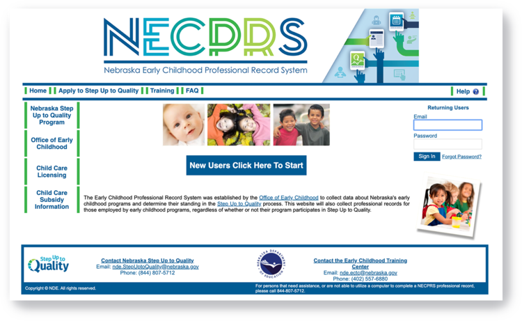
Original Portal page
Users have to recall where certain information is located to navigate page.
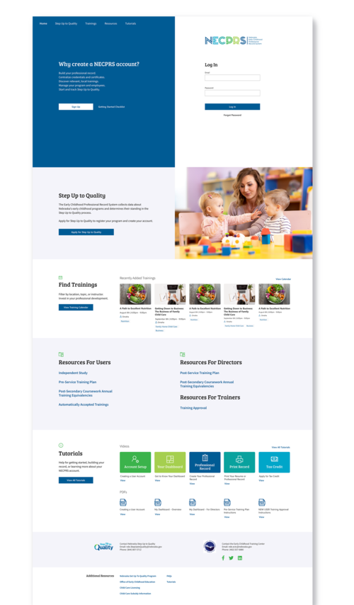
Implemented design
KRUTSCH had the users in mind when recreating the portal page for NECPRS. The new design makes it easy for users to recognize where certain action items are.
7. Flexibility and Efficiency of Use
When using an app, after a while a novice user will most likely become an expert. Showing appreciation to experts by creating shortcuts that most basic users will not find helps cater to them while still making the app workable for basic users.

Common shortcuts used everyday, like copy and paste, allow functions to be easier and less time consuming.
8. Aesthetic and Minimalist Design
User interfaces should only have information that is relevant and needed to the user. All unnecessary information can drag the user's attention, limiting them from retrieving what they actually need. This does not mean the design needs to be plain. What is important is that the content and visual design focus on the essentials and support the user's goals.
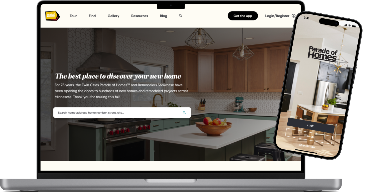
Parade of Homes' minimalistic home page design.
9. Help Users Recognize, Diagnose and Recover From Error
UX designers need to make error messages expressive through plain language and visual elements. The user's attention must be grabbed so they can identify the problem and the solution to it.
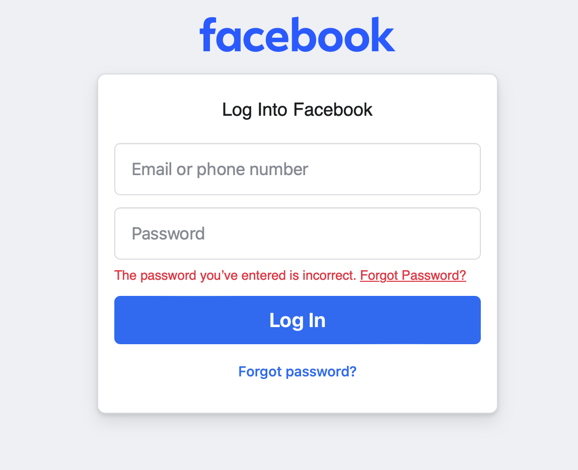
Facebook and many other apps help users recognize error when they inform about the password being incorrect.
10. Help and Documentation
In the best-case scenario, a user should not need any explanation on how to use your app. However, sometimes it may be necessary to have documentation incorporated that will help users understand how to complete tasks that may not be clear through navigating the app alone.
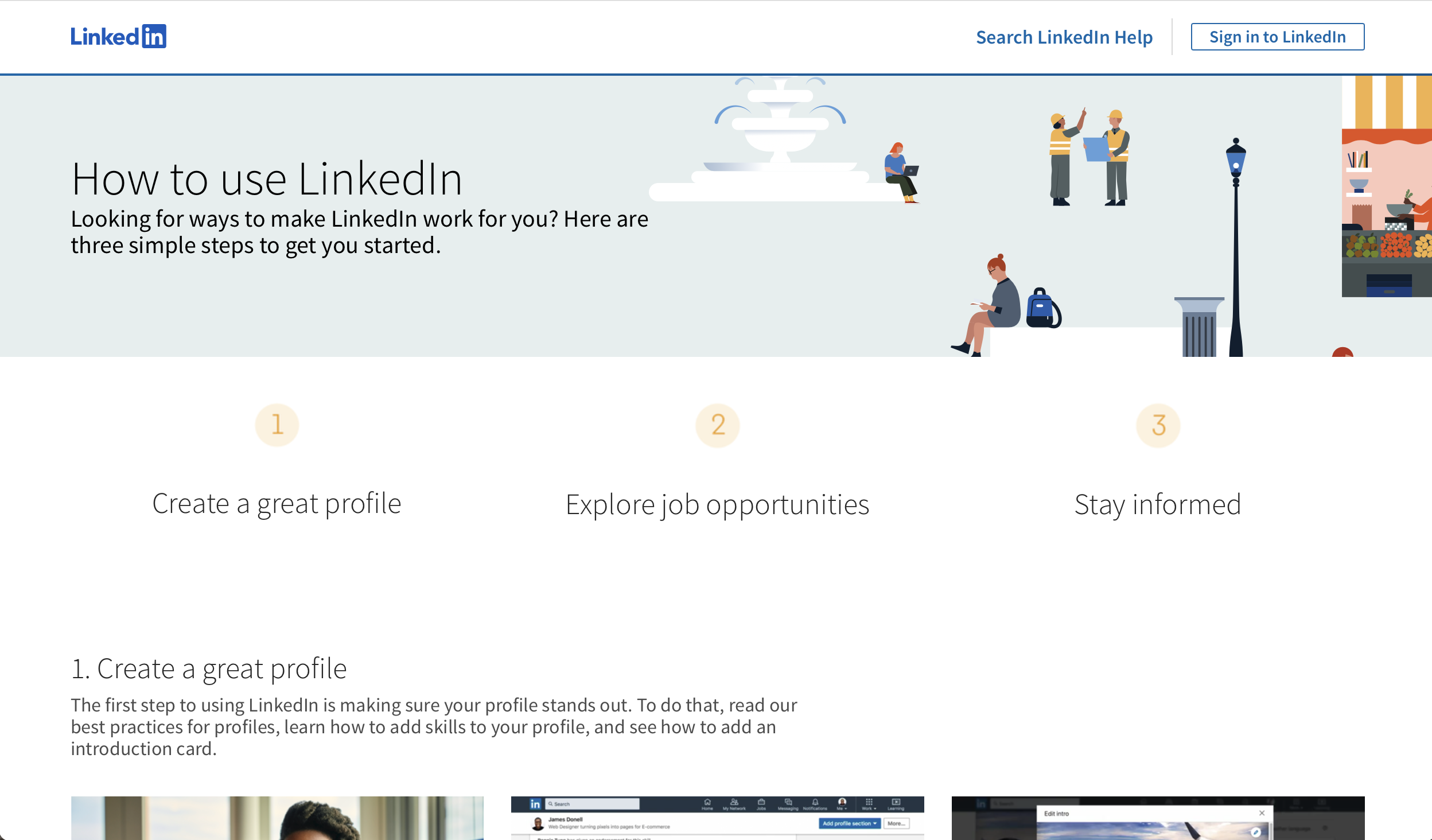
LinkedIn's user guide detailing how to use LinkedIn.
Why are UI Design Guidelines Important?
When users use an app, they expect it to be of good quality and be able to help improve their life. Guidelines allow good design to be possible. Building good design can improve brand reputation and build customer loyalty.
Remember though, guidelines are guidelines. They are not steadfast rules. Implement intentional design choices which reflect your end user goal and view system design guidelines as a framework on which your app is built. You know your app's goals and needs better than anyone. Don't worry if you think your app is a little too customized. If it is an issue, it will become apparent during usability testing and app store submittal.
Using guidelines are just another way we ensure consistency across multiple apps and reduce user confusion.
End Note
Follow us on LinkedIn to see the next article in your feed.

Megan Thompson is a graphic designer at KRUTSCH who believes good design is intuitive and uncomplicated.
She is a lifelong learner constantly striving to better her design practice and workflow, and won’t hesitate to integrate new processes as they become available.
Follow KRUTSCH on LinkedIn to read the follow-up posts in the series.